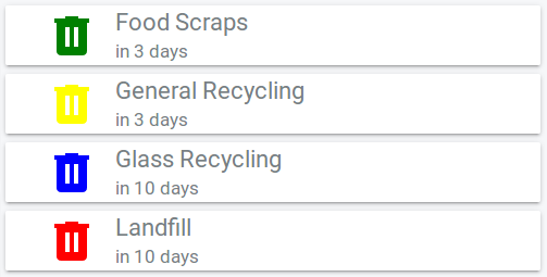
Last month, I wrote a quick post about the Home Assistant Rubbish Collection panel I made for the Lovelace UI. Well, it looks like amaximus was inspired to create his own custom card to do a similar thing. [NOTE: the author of this card hasn’t contacted me directly (I came across it via HACS), I’m only claiming to be the inspiration based on the relative dates].
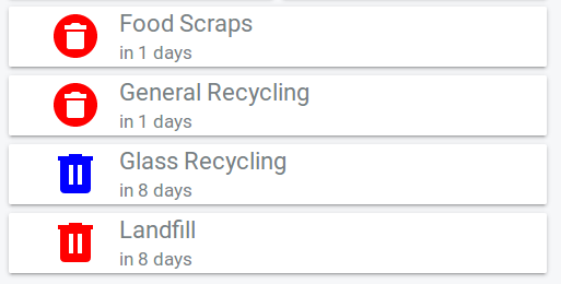
This card has a couple of cool capabilities that my previous panel didn’t have. Specifically, you can set colour coded icons for your different bins and the icon will change style and colour (to red) when the bin is due to go out in the next day. You can also hide the card completely if a bin is not due to go out within X days.


Installation and Setup
I installed the card by adding a git submodule to my configuration repository in the www/plugins directory, but you can also install directly from HACS. I’m switching over to adding all my custom components and cards as submodules in order to make my config more easily deployable.
After installation, you need to add the path to the garbage-collection-card.js file in the resources section of your Lovelace UI config:
resources:
  - type: js
    url: /local/plugins/garbage-collection-card/garbage-collection-card.js
Once that’s done you can add cards to the UI. I just put mine in a vertical stack to group them together:
type: vertical-stack
cards:
  - type: 'custom:garbage-collection-card'
    entity: sensor.food_scraps
    hide_date: true
    icon_color: green
    icon_size: 48px
  - type: 'custom:garbage-collection-card'
    entity: sensor.general_recycling
    hide_date: true
    icon_color: yellow
    icon_size: 48px
  - type: 'custom:garbage-collection-card'
    entity: sensor.glass_recycling
    hide_date: true
    icon_color: blue
    icon_size: 48px
  - type: 'custom:garbage-collection-card'
    entity: sensor.landfill
    hide_date: true
    icon_color: red
    icon_size: 48px
…and that’s it! If you want to hide a card for bins that don’t need to go out soon use hide_before: x (where x is the number of days). I’ll probably use this to hide bins that don’t need to go out in the current week, but I wanted to show all the cards in the screenshots 😉
Conclusion
I think this is a great improvement on my previous panel, so I’m going to stick with it. Thanks to the author another contributors for taking the time to make it!
It’s kinda cool to think that this blog may have inspired someone else to go out and write some code! If you are inspired to make and share something as a result of one of my posts, please get in contact! Your work will most likely get featured in a future blog post.
Leave a Reply