Welcome to a new segment on my blog! Here I’m going to do quick write ups of some of the little projects that I complete. These projects often come between the bigger ones that I usually write about. This is going to be bit of an experiment, but I’m aiming to publish these in addition to my usual blogging schedule. However, they will be done as time permits so may not be as regular.
I wanted to start doing posts like this, since I realised I do quite a few small projects which never make it onto the blog. Primarily this is because I just forget about them once they’re complete. Let’s see how it goes and please let me know if you like these posts in the comments or via Twitter.
Today’s Project: a Lovelace Multi-Room Audio Controller
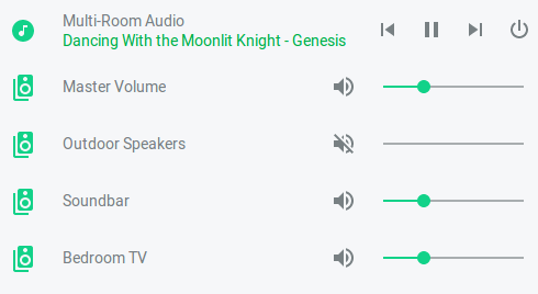
This post is about a bit of playing around I was doing in Lovelace (the new Home Assistant UI) over the weekend. I started out installing the Home Assistant Community Store (HACS) and came across the Mini Media Player card. This struck me as the perfect thing for making better controls for my multi-room audio system. Without further ado, here are the finished Lovelace multi-room audio controller in all its glory:

Basically, we have controls of the main Mopidy music player. This is followed by the volume controls for the overall Snapcast group and the individual Snapcast clients. This is pretty much a copy of the layout in the Snapcast Android client. However, that lacks any way to control the player.
Get to the YAML!
Below is the YAML I used to create my Lovelace multi-room audio controller. Is should be noted that this can be entered through the GUI editor, by just switching to the raw editor. You don’t need to be using YAML mode.
type: vertical-stack
cards:
  - artwork: cover
    entity: media_player.mopidy
    group: true
    hide:
      source: true
      volume: true
    icon: 'mdi:music-circle'
    name: Multi-Room Audio
    type: 'custom:mini-media-player'
  - entity: media_player.snapcast_group_mopidy
    group: true
    hide:
      controls: true
      power: true
      power_state: true
      source: true
      volume: false
    icon: 'mdi:speaker-multiple'
    name: Master Volume
    type: 'custom:mini-media-player'
  - entity: media_player.snapcast_client_outdoor_speakers
    group: true
    hide:
      controls: true
      power: true
      power_state: true
      source: true
      volume: false
    icon: 'mdi:speaker-multiple'
    type: 'custom:mini-media-player'
  - entity: media_player.snapcast_client_soundbar
    group: true
    hide:
      controls: true
      power: true
      power_state: true
      source: true
      volume: false
    icon: 'mdi:speaker-multiple'
    type: 'custom:mini-media-player'
  - entity: media_player.snapcast_client_bedroom_tv
    group: true
    hide:
      controls: true
      power: true
      power_state: true
      source: true
      volume: false
    icon: 'mdi:speaker-multiple'
    type: 'custom:mini-media-player'
This consists of a vertical stack card containing several mini media player cards with the group setting set to true to make them nest fine into a what appears visually to be a single control panel. I then just use the hide parameters to get rid of the controls I don’t need on each one and add a custom icon for each. Done!
Conclusion
I really like this layout. The only improvement I can think of would be if the cover artwork for the currently playing track was displayed. You can see I’ve tried this in the YAML above, but it didn’t work for me. This might be more of a limitation of the MPD integration in HASS than of mini media player.
That’s it for now. Again, please let me know if you like this post format and I’ll keep doing them in between my other posts.
Leave a Reply